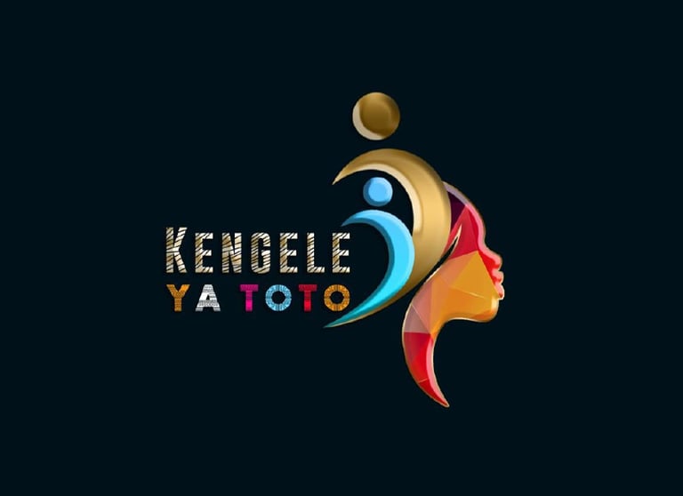
Crafting Identity: The Creative Journey of Designing the Kengele ya Toto Logo
DESIGN TRENDS
Researching the world of children's entertainment and music allowed me to gather inspiration from diverse sources.
In the vibrant world of graphic design, the creation of a logo is more than a visual endeavor; it's a meticulous journey that involves passion, creativity, and a deep understanding of the brand's identity. This article unravels the captivating process I embarked upon in designing the logo for "Kengele ya Toto," providing insights into the artistry, decisions, and inspirations that brought this visual identity to life.
1. Understanding the Essence:
Every logo begins with a deep dive into the essence of the brand it represents. In the case of Kengele ya Toto, a children's music initiative, the exploration revolved around the playful, educational, and culturally rich aspects of the content. Understanding the brand's core values and target audience set the foundation for the visual narrative.
2. Research and Inspiration:
Researching the world of children's entertainment and music allowed me to gather inspiration from diverse sources. From playful color palettes to whimsical typography, every element drew from the rich tapestry of childhood, ensuring that the logo resonated with the young audience it aimed to captivate.
3. Sketching Ideas on Paper:
Before diving into the digital realm, I embraced the simplicity of sketching on paper. This analog phase allowed ideas to flow freely, giving shape to initial concepts and rough sketches. It was a playground of possibilities, where I could experiment with various symbols, fonts, and layouts.
4. Digital Exploration:
Transitioning from paper to the digital canvas marked the next phase of the journey. Using design software, I refined and expanded upon the most promising sketches. This digital exploration involved experimenting with color variations, adjusting proportions, and fine-tuning details to ensure that the logo would be visually striking and versatile across different mediums.
5. Symbolism and Icons:
A key aspect of logo design is the incorporation of meaningful symbols. For Kengele ya Toto, I wanted an icon that represented both music and childhood. The inclusion of musical notes forming a playful silhouette of a child dancing captured the essence of the brand. The symbolism aimed to convey the joy, rhythm, and educational aspect of the content.
6. Font Selection:
Choosing the right typography is crucial for a logo's legibility and personality. In this case, the font needed to balance a sense of playfulness with readability. After exploring various options, I settled on a custom typeface that complemented the visual elements, ensuring a cohesive and harmonious design.
7. Iterative Refinement:
The design journey is seldom linear, and the iterative refinement process is where the logo truly takes shape. Feedback from stakeholders and my own critical evaluation guided adjustments to enhance clarity, balance, and overall visual impact. This cyclical process continued until every element seamlessly aligned with the brand's identity.
8. Color Palette Harmonization:
Colors evoke emotions and contribute significantly to brand identity. The color palette for Kengele ya Toto was chosen with care, combining vibrant, child-friendly hues that mirrored the energy of music and the exuberance of childhood. The harmonization of colors aimed to create a visually appealing and cohesive representation.
9. Testing Across Platforms:
A well-designed logo must be versatile across various platforms and applications. Testing the logo in different contexts—on websites, social media, print materials, and merchandise—ensured that it maintained its visual integrity and impact. This step is vital to guarantee the logo's effectiveness in diverse settings.
10. Finalizing the Masterpiece:
After numerous iterations, adjustments, and thoughtful considerations, the Kengele ya Toto logo emerged as a visual masterpiece that encapsulated the spirit of the brand. The final design seamlessly integrated elements of music, childhood, and education, forming a distinctive visual identity that resonates with the target audience.
The journey of designing the Kengele ya Toto logo exemplifies the intricate process of translating a brand's essence into a visual masterpiece. From initial inspiration to the iterative refinement, each step was a deliberate exploration of creativity and strategy. The resulting logo stands as a vibrant symbol, not just on its own but as a representation of the rich world of children's music and educational content that Kengele ya Toto aims to deliver to its young audience.
Related Stories
Elruet Design And Technology Ltd © 2024
Eldesign.agency empowers the generation of tomorrow for a brighter future and hope for every individual.
Reframe your inbox
Subscribe to our newsletter and never miss a story.
We care about your data in our privacy policy.